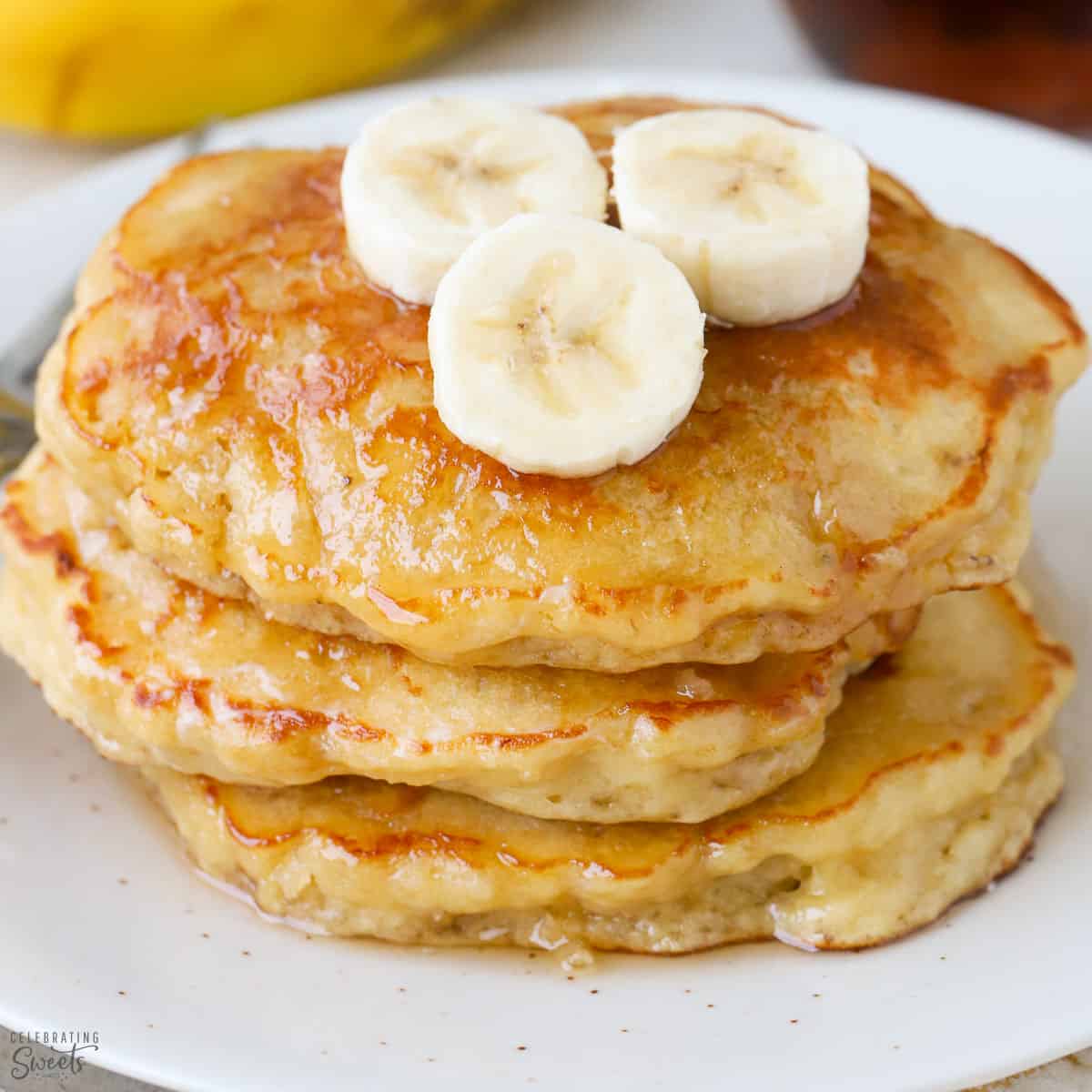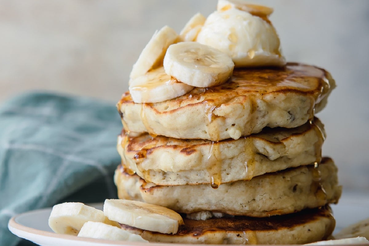


Description: WHY YOU’LL LOVE THIS FLUFFY BANANA PANCAKES RECIPE
- Fluffy and moist: No one likes a dry pancake that’s dense and heavy. These banana pancakes are light, fluffy, and moist. They’re the perfect texture!
- Easy to make: This recipe is super simple and comes together in just a few minutes. You don’t need any fancy ingredients or gadget s – just a bowl, a whisk, and a frying pan!
- Full of flavor: These pancakes are subtly sweet, with a hint of banana and cinnamon flavor. They’re not too overwhelming, but they’re just right.
- The perfect breakfast (or dessert!): These pancakes make the perfect breakfast or dessert. Serve them up with some fresh fruit, syrup, and a dollop of whipped cream for a real treat!
- Great for meal prep: These pancakes freeze well, so they’re perfect for meal prep. Make a batch on the weekend and enjoy them all week long!
Estimated Time
- Prep Time: 5 mins
- Cook Time: 10 mins
Ingredients
Serving Size: 8 Pancakes
- 3/4 Bananas
- 1/2 Teaspoon Cinnamon
- 1 Cup All-purpose Flour
- 1 Large Egg
- 1 Tablespoon Baking Powder
- 1/4 Teaspone Salt
- 3/4 Cup of Milk
- Banana Slicies & Maple Syrup for serving
Equipments
- Mixing Bowls
- Ballon Whisk
- Nonstick Pan
- Measuring Cups and Spoons
Instructions
- In a medium bowl, whisk together the flour, baking powder, cinnamon, and salt.
- In another, larger bowl, beat the banana and egg together until blended.
- Whisk in the milk until combined, then whisk in the dry ingredients. The batter will be slightly lumpy.
- Heat a large nonstick pan over medium heat. Spray with nonstick cooking spray.
- Using a ⅓-cup measuring cup, pour 3-4 circles of batter into the pan.
- Cook until the pancakes are puffed on top and golden brown on the bottom, 2-3 minutes, then flip and cook on the other side until risen and cooked through, 1-2 minutes more. Makes 8 pancakes.
- Serve with banana slices and maple syrup.
Storing Suggestions
- These pancakes are best served fresh, but if you have leftovers, they can be stored in an airtight container in the fridge.
- Stored in an airtight container, these pancakes will last in the fridge for up to four days.
- Reheat them in the microwave for 30-60 seconds or in a pan over low heat until warmed throug
Recipe Websites
America's Taste Kitchen
I like how professional and straightforward the design is, reflecting the brand’s focus on reliable recipes. It avoids excessive embellishments that can distract from the content. Additionally, I appreciate the light red background, which creates a cozy atmosphere that's perfect for home cooking recipes.
NYT Cooking
The website features a clean and modern design with a focus on high-quality images, which enhances the appeal of the recipes. The use of whitespace helps to avoid clutter, allowing users to focus on content. The search bar is also well designed in which it allows the users to quickly look up specific recipes or occasions people can cook for.
Spend with Pennies
I like how the design is warm and inviting, using a friendly color palette and appealing images that resonate with home cooks. Also the inclusion of user reviews and photos encourages community interaction and provides social proof of the recipes' success.
Non-recipe Websites
Medium
I love how this website focuses on content and readability with a minimalist design that emphasizes white space. The platform’s use of large fonts and a clean layout helps me focus on the articles without distraction. For my recipe website, I can consider prioritizing clear, readable fonts and ample white space.
Eric Nam
My favorite is the homepage featuring a large, striking image of the artist, instantly grabbing my attention. I think this technique can be applied to my recipe website by using high-quality images of finished dishes or vibrant ingredients to draw users in.
Airbnb
I like the stunning visuals and an intuitive layout to create an engaging user experience. The use of high-quality images immediately captures attention, making the content feel inviting. Additionally, the website's clean and simple navigation allows users to explore easily without feeling overwhelmed. These are all helpful techniques that I should consider when designing my websites.